






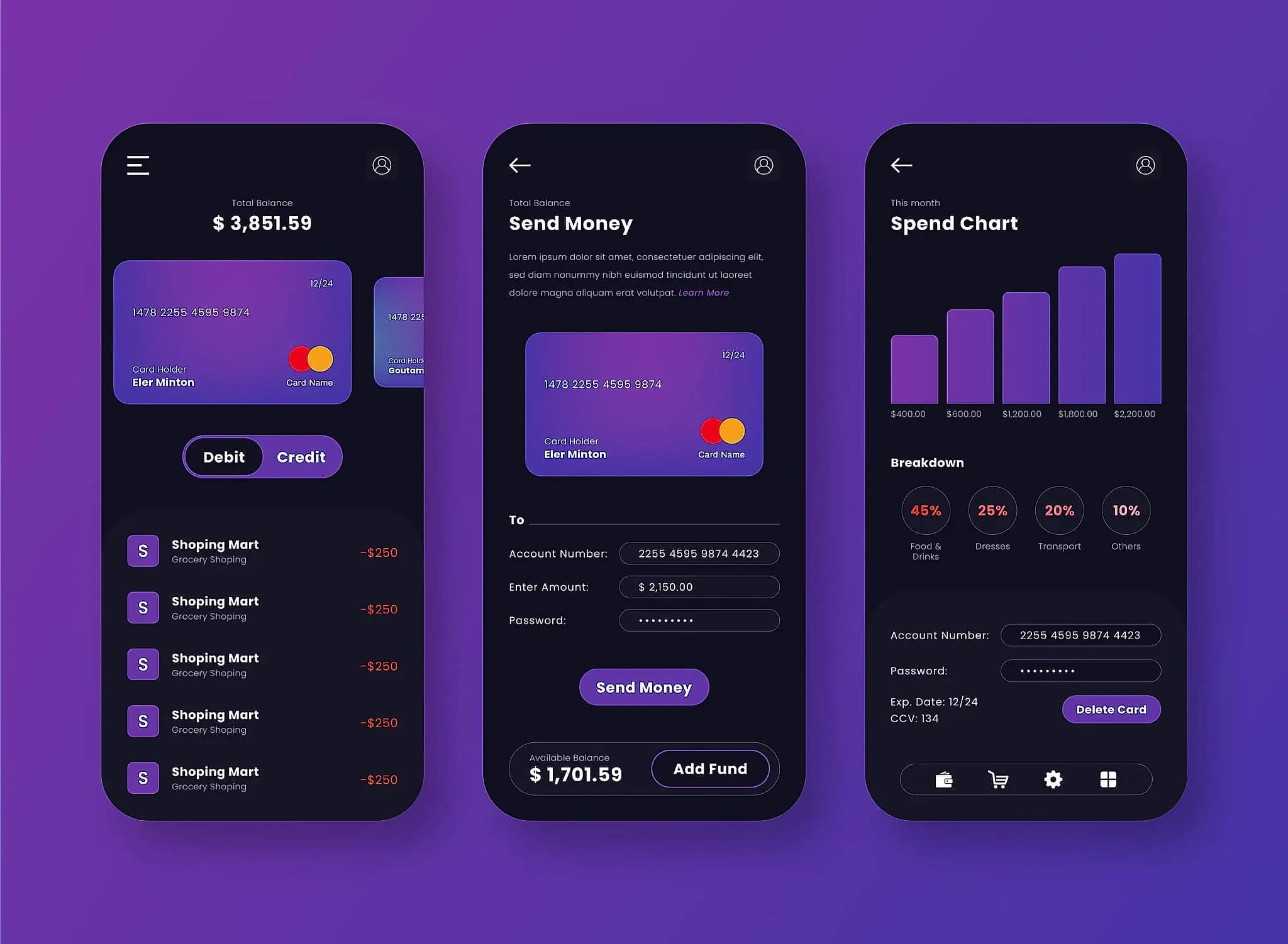
When people move money, they're really moving trust. A single confusing moment — an amount that renders ambiguously, a confirmation step that feels too easy to trigger by accident, a status page that goes quiet mid-transfer — can undo months of good engineering. Nobody remembers the 400 times your app worked perfectly. Everyone remembers the one time it made them nervous.
Clarity beats cleverness
Fintech is one of the few product categories where being clever is actively a liability. A delightful micro-interaction on a social app is charming. The same instinct applied to a balance screen or a transfer confirmation reads as evasive, even when the underlying logic is sound. We favor plain language over marketing copy, obvious affordances over gestures the user has to discover, and generous confirmation moments over slick-but-ambiguous flows that shave a tap off the happy path at the cost of the one time someone gets it wrong.
This sounds like it should slow a product down. In practice it speeds up trust, and trust is what determines whether someone comes back. A user who isn't sure whether their payment went through will contact support, abandon the app, or worse — try the action again and duplicate it. The fastest support ticket is the one that never gets opened because the interface already answered the question.
Consistency is a security feature
A design system isn't just an efficiency tool for engineering teams — it's one of the more underrated trust signals in fintech. When every screen behaves the way the last one did, users build an accurate mental model of what's normal, which means they're far more likely to notice when something isn't. Phishing pages and social-engineering attempts thrive on inconsistency going unnoticed; a product that's rigorously consistent makes the fake version easier to spot, for the user and for your own fraud team.
We treat this the same way we treat any other compliance requirement: not as a nice-to-have, but as a checklist item that gets reviewed on every release. Button placement, error tone, confirmation copy, even the exact wording of a decline reason — all of it either reinforces the pattern a user has learned to trust, or quietly erodes it.
Building it in from day one
The mistake we see most often isn't bad visual design — most fintech products look perfectly polished. It's trust decisions made ad hoc, screen by screen, by whoever happened to be building that feature that sprint. We start every fintech engagement with a short set of house rules for exactly this: how amounts render, how destructive actions confirm, how errors explain themselves. Decide it once, apply it everywhere, and the product feels trustworthy before a single user has a reason to doubt it.